B-ω Diagram
Below is an example for plotting a B-ω diagram using WaLSAtools for a times series of images from observations with SDO/AIA 170 nm (sampling heights approximately corresponding to temperature minimum of the solar atmosphere) as well as a magnetogram from SDO/HMI, corresponding to the middle of the AIA observations.
B-ω diagram for a small region of interest in the sample datacube
To learn how WaLSAtools is employed to compute and plot the B-ω diagram in this example, please go through its source code accessible at the bottom of this page.
The example IDL procedure can also be found under the examples/idl/ directory of the package. The sample datacubes are located in the sample_data folder under the examples directory.
To run the example code, simply type the following command (while in the examples/idl/ directory, which can be placed anywhere in your machine, also outside your IDL PATH) and press Enter
IDL> .r example_bomega
Below are some examples of the information begin printed in terminal. For simplicity, % Compiled module: messages and repeated information are not shown below.
% Compiled module: WALSATOOLS.

    __          __          _          _____
    \ \        / /         | |        / ____|     /\
     \ \  /\  / /  ▄▄▄▄▄   | |       | (___      /  \
      \ \/  \/ /   ▀▀▀▀██  | |        \___ \    / /\ \
       \  /\  /   ▄██▀▀██  | |____    ____) |  / ____ \
        \/  \/    ▀██▄▄██  |______|  |_____/  /_/    \_\


  © WaLSA Team (www.WaLSA.team)
 -----------------------------------------------------------------------------------
  WaLSAtools v1.0
  Documentation: www.WaLSA.tools
  GitHub repository: www.github.com/WaLSAteam/WaLSAtools
 -----------------------------------------------------------------------------------

The input datacube is of size: [91, 41, 610]

Temporally, the important values are:
    2-element duration (Nyquist period) = 24.0000 seconds
    Time series duration = 7320 seconds
    Nyquist frequency = 41.6667 mHz

== detrend next row...    91/   91

.... % finished (through bins, from larger B): 100.

 mode = 0: log(power)

COMPLETED!
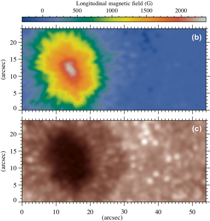
The output figure of this example is illustrated in panel (a), where the averaged (temporal) power spectra within each magnetic-field bin (with 50 G width) are plotted along the y axis. Thus the background colour represents the power spectral density (plotted in a base 10 logarithmic scale). The two horizontal dashed lines mark the periods (or frequencies) of three and five minutes oscillations. Panels (c) and (d), respectively, illustrate the longitudinal magnetic-field map from SDO/HMI and one image of the SDO/AIA 170 nm time series (corresponding to the middle of the observations) for the region of interest analysed here.
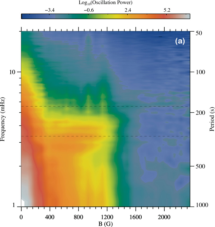
Please note that, in this example, the power is considerably smaller in the larger magnetic-field regions compared to the areas with lower magnetic fields, though it still can be significant in some frequencies.
One reason is that the amplitudes of fluctuations are likely very small inside the umbra at these observations (which can depend on many factors, including the spatial resolution and the height ranges sampled by these observations).
One way to identify power enhancements in individual bins is to use the /normalizedbins keyword, which normalises each power spectrum (in each bin) to it maximum value. See here to learn about all keywords available to this analysis tool.
As a guide, see this scientific article where this approach could help revealing signatures of resonant MHD oscillations in a pore umbra.
Source code
1 | |