 1
 2
 3
 4
 5
 6
 7
 8
 9
10
11
12
13
14
15
16
17
18
19
20
21
22
23
24
25
26
27
28
29
30
31
32
33
34
35
36
37
38
39
40
41
42
43
44
45
46
47
48
49
50
51
52
53
54
55
56
57
58
59
60
61
62
63
64
65
66
67
68
69
70
71
72
73
74
75
76
77
78
79
80
81
82
83
84
85
86
87
88
89
90
91
92
93
94
95
96
97
98
99
100
101
102
103
104
105
106
107
108
109
110
111
112
113
114
115
116
117
118
119
120
121
122
123
124
125
126
127
128
129
130
131
132
133
134
135
136
137
138
139
140
141
142
143
144
145
146
147
148
149
150
151
152
153
154
155
156
157
158
159
160
161
162
163
164
165
166
167
168
169
170
171
172
173
174
175
176
177
178
179
180
181
182
183
184
185
186
187
188
189
190
191
192
193
194
195
196
197
198
199
200
201
202
203
204
205
206
207
208
209
210
211
212
213
214
215
216
217
218
219
220
221
222
223
224
225
226
227
228
229
230
231
232
233
234
235
236
237
238
239
240
241
242
243
244
245
246
247
248
249
250
251
252
253
254
255
256
257
258
259
260
261
262
263
264
265
266
267
268
269
270
271
272
273
274
275
276
277
278
279
280
281
282
283
284
285
286
287
288
289
290
291
292
293
294
295
296
297
298
299
300
301
302
303
304
305
306
307
308
309
310
311
312
313
314
315
316
317
318
319
320
321
322
323
324
325
326
327
328
329
330
331
332
333
334
335
336
337
338
339
340
341
342
343
344
345
346
347
348
349
350
351
352
353
354
355
356
357
358
359
360
361
362
363
364
365
366
367
368
369
370
371
372
373
374
375
376
377
378
379
380
381
382
383
384
385
386
387
388
389
390
391
392
393
394
395
396
397
398
399
400
401
402
403
404
405
406
407
408
409
410
411
412
413
414
415
416
417
418
419
420
421
422
423
424
425
426
427
428
429
430
431
432
433
434
435
436
437
438
439
440
441
442
443
444
445
446
447
448
449
450
451
452
453
454
455
456
457
458
459
460
461
462
463
464
465
466
467
468
469
470
471
472
473
474
475
476
477
478
479
480
481
482
483
484
485
486
487
488
489
490
491
492
493
494
495
496
497
498
499
500
501
502
503
504
505
506
507
508
509
510
511
512
513
514
515
516
517
518
519
520
521
522
523
524
525
526
527
528
529
530
531
532
533
534
535
536
537
538
539
540
541
542
543
544
545
546
547
548
549
550
551
552
553
554
555
556
557
558
559
560
561
562
563
564
565
566
567
568
569
570
571
572
573
574
575
576
577
578
579
580
581
582
583
584
585
586
587
588
589
590
591
592
593
594
595
596
597
598
599
600
601
602
603
604
605
606
607
608
609
610
611
612
613
614
615
616
617
618
619
620
621
622
623
624
625
626
627
628
629
630
631
632
633
634
635
636
637
638
639
640
641
642
643
644
645
646
647
648
649
650
651
652
653
654
655
656
657
658
659
660
661
662
663
664
665
666
667
668
669
670
671
672
673
674
675
676
677
678
679
680
681
682
683
684
685
686
687
688
689
690
691
692
693
694
695
696
697
698
699
700
701
702
703
704
705
706
707
708
709
710
711
712
713
714
715
716
717
718
719
720
721
722
723
724
725
726
727
728
729
730
731
732
733
734
735
736
737
738
739
740
741
742
743
744
745
746
747
748
749
750
751
752
753
754
755
756
757
758
759
760
761
762
763
764
765
766
767
768
769
770
771
772
773
774
775
776
777
778
779
780
781
782
783
784
785
786
787
788
789
790
791
792
793
794
795
796
797
798
799
800
801
802
803
804
805
806
807
808
809
810
811
812
813
814
815
816
817 | import matplotlib.pyplot as plt
from matplotlib.ticker import AutoMinorLocator
from matplotlib.colors import ListedColormap
from matplotlib.ticker import AutoMinorLocator, FormatStrFormatter
from mpl_toolkits.axes_grid1 import make_axes_locatable
from mpl_toolkits.axes_grid1.inset_locator import inset_axes
from WaLSAtools import WaLSA_save_pdf
# Setting global parameters
plt.rcParams.update({
'font.family': 'sans-serif', # Use sans-serif fonts
'font.sans-serif': 'Arial', # Set Helvetica as the default sans-serif font
'font.size': 13.5, # Global font size
'axes.titlesize': 13.5, # Title font size
'axes.labelsize': 13.5, # Axis label font size
'xtick.labelsize': 13.5, # X-axis tick label font size
'ytick.labelsize': 13.5, # Y-axis tick label font size
'legend.fontsize': 13.5, # Legend font size
'figure.titlesize': 13.5, # Figure title font size
'axes.grid': False, # Turn on grid by default
'grid.alpha': 0.5, # Grid transparency
'grid.linestyle': '--', # Grid line style
'font.weight': 500, # Make all fonts bold
'axes.titleweight': 500, # Make title font bold
'axes.labelweight': 500 # Make axis labels bold
})
plt.rc('axes', linewidth=1.0)
plt.rc('lines', linewidth=0.8)
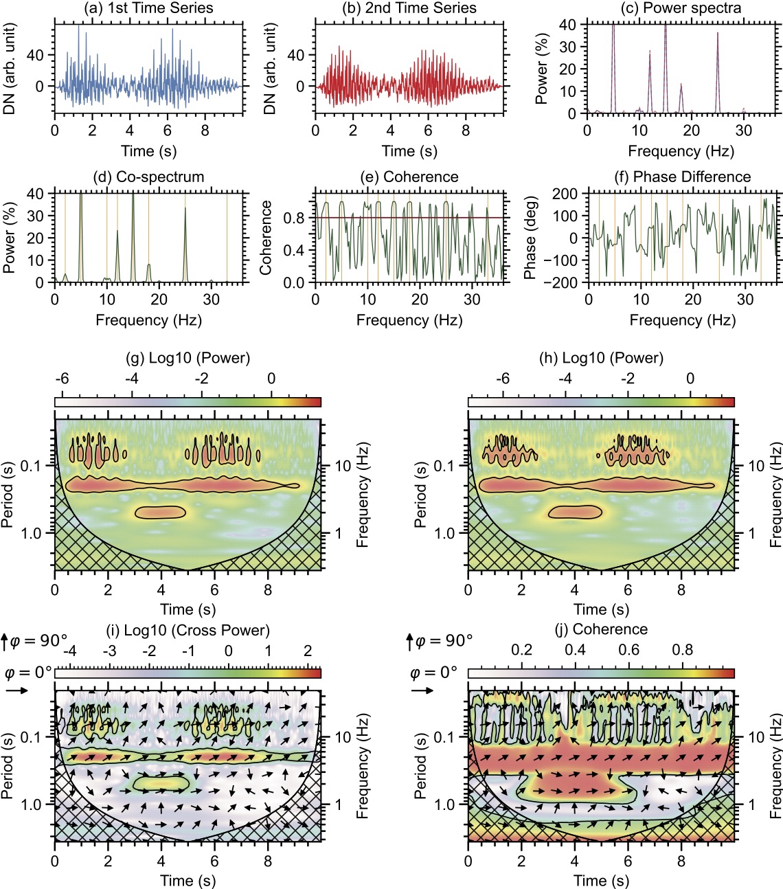
pre_defined_freq = [2,5,10,12,15,18,25,33] # Mark pre-defined frequencies
# Set up the figure layout
fig = plt.figure(figsize=(9.5, 10.79))
#--------------------------------------------------------------------------
# FFT/Welch
plots_width = 0.24
plots_height = 0.10
positions = [[0.07, 0.872, plots_width, plots_height], [0.403, 0.872, plots_width, plots_height], [0.750, 0.872, plots_width, plots_height],
[0.07, 0.682, plots_width, plots_height], [0.403, 0.682, plots_width, plots_height], [0.752, 0.682, plots_width,plots_height]
] # [left, bottom, width, height]
# First 1D signal plot
ax1 = fig.add_axes(positions[0])
ax1.plot(time, signal_1d_data1 * 10, color='dodgerblue')
ax1.set_xlabel('Time (s)', labelpad=5)
ax1.set_ylabel('DN (arb. unit)', labelpad=8)
ax1.set_title('(a) 1st Time Series', pad=10)
ax1.set_ylim(-35, 79)
ax1.set_xlim([0, 10])
# Set tick marks outside for all four axes
ax1.tick_params(axis='both', which='both', direction='out', top=True, right=True)
# Custom tick intervals
ax1.set_xticks(np.arange(0, 10, 2))
ax1.set_yticks(np.arange(0, 80, 40))
# Custom tick sizes and thickness
ax1.tick_params(axis='both', which='major', length=6, width=1.3) # Major ticks
ax1.tick_params(axis='both', which='minor', length=3, width=1.3) # Minor ticks
# Set minor ticks
ax1.xaxis.set_minor_locator(AutoMinorLocator(4))
ax1.yaxis.set_minor_locator(AutoMinorLocator(5))
# Second 1D signal plot
ax2 = fig.add_axes(positions[1])
ax2.plot(time, signal_1d_data2 * 10, color='red')
ax2.set_xlabel('Time (s)', labelpad=5)
ax2.set_ylabel('DN (arb. unit)', labelpad=8)
ax2.set_title('(b) 2nd Time Series', pad=10)
ax2.set_ylim(-35, 79)
ax2.set_xlim([0, 10])
# Set tick marks outside for all four axes
ax2.tick_params(axis='both', which='both', direction='out', top=True, right=True)
# Custom tick intervals
ax2.set_xticks(np.arange(0, 10, 2))
ax2.set_yticks(np.arange(0, 80, 40))
# Custom tick sizes and thickness
ax2.tick_params(axis='both', which='major', length=6, width=1.3) # Major ticks
ax2.tick_params(axis='both', which='minor', length=3, width=1.3) # Minor ticks
# Set minor ticks
ax2.xaxis.set_minor_locator(AutoMinorLocator(4))
ax2.yaxis.set_minor_locator(AutoMinorLocator(5))
# FFT Power Spectra
ax3 = fig.add_axes(positions[2])
ax3.plot(frequencies_welch, 85 * power1_welch / np.max(power1_welch), color='dodgerblue')
ax3.plot(frequencies_welch, 85 * power2_welch / np.max(power2_welch), linestyle='-.', color='red', linewidth=0.5)
ax3.set_xlabel('Frequency (Hz)', labelpad=5)
ax3.set_ylabel('Power (%)', labelpad=8)
ax3.set_title('(c) Power spectra', pad=10)
ax3.set_xlim([0, 36])
ax3.set_ylim(0, 40)
# Set tick marks outside for all four axes
ax3.tick_params(axis='both', which='both', direction='out', top=True, right=True)
# Custom tick intervals
ax3.set_xticks(np.arange(0, 36, 10))
ax3.set_yticks(np.arange(0, 41, 10))
# Custom tick sizes and thickness
ax3.tick_params(axis='both', which='major', length=6, width=1.3) # Major ticks
ax3.tick_params(axis='both', which='minor', length=3, width=1.3) # Minor ticks
# Set minor ticks
ax3.xaxis.set_minor_locator(AutoMinorLocator(10))
ax3.yaxis.set_minor_locator(AutoMinorLocator(5))
# FFT Cross Spectrum
ax4 = fig.add_axes(positions[3])
for freqin in pre_defined_freq:
ax4.axvline(x=freqin, color='orange', linewidth=0.5)
ax4.plot(frequencies_welch, 92 * cospectrum_welch / np.max(cospectrum_welch), color='DarkGreen')
ax4.set_xlabel('Frequency (Hz)', labelpad=5)
ax4.set_ylabel('Power (%)', labelpad=8)
ax4.set_title('(d) Co-spectrum', pad=10)
ax4.set_xlim([0, 36])
ax4.set_ylim(0, 40)
# Set tick marks outside for all four axes
ax4.tick_params(axis='both', which='both', direction='out', top=True, right=True)
# Custom tick intervals
ax4.set_xticks(np.arange(0, 36, 10))
ax4.set_yticks(np.arange(0, 41, 10))
# Custom tick sizes and thickness
ax4.tick_params(axis='both', which='major', length=6, width=1.3) # Major ticks
ax4.tick_params(axis='both', which='minor', length=3, width=1.3) # Minor ticks
# Set minor ticks
ax4.xaxis.set_minor_locator(AutoMinorLocator(10))
ax4.yaxis.set_minor_locator(AutoMinorLocator(5))
# FFT Coherence
ax5 = fig.add_axes(positions[4])
for freqin in pre_defined_freq:
ax5.axvline(x=freqin, color='orange', linewidth=0.5)
ax5.plot(freq_coherence_welch, coherence_welch, color='DarkGreen')
ax5.set_xlabel('Frequency (Hz)', labelpad=5)
ax5.set_ylabel('Coherence', labelpad=8)
ax5.set_title('(e) Coherence', pad=10)
ax5.set_xlim([0, 36])
ax5.set_ylim(0, 1.1)
# Set tick marks outside for all four axes
ax5.tick_params(axis='both', which='both', direction='out', top=True, right=True)
# Custom tick intervals
ax5.set_xticks(np.arange(0, 36, 10))
ax5.set_yticks(np.arange(0, 1.1, 0.2))
ax5.set_yticklabels(['0.0', ' ', '0.4', ' ', '0.8', ' '])
# Custom tick sizes and thickness
ax5.tick_params(axis='both', which='major', length=6, width=1.3) # Major ticks
ax5.tick_params(axis='both', which='minor', length=3, width=1.3) # Minor ticks
# Set minor ticks
ax5.xaxis.set_minor_locator(AutoMinorLocator(10))
ax5.yaxis.set_minor_locator(AutoMinorLocator(4))
# Add a horizontal line at coherence = 0.8 (as a threshold)
ax5.axhline(y=0.8, color='darkred', linewidth=1.1)
# FFT Phase Differences
ax6 = fig.add_axes(positions[5])
for freqin in pre_defined_freq:
ax6.axvline(x=freqin, color='orange', linewidth=0.5)
ax6.plot(frequencies_welch, phase_angle_welch, color='DarkGreen')
ax6.set_xlabel('Frequency (Hz)', labelpad=5)
ax6.set_ylabel('Phase (deg)', labelpad=4)
ax6.set_title('(f) Phase Difference', pad=10)
ax6.set_xlim([0, 36])
ax6.set_ylim(-200, 200)
# Set tick marks outside for all four axes
ax6.tick_params(axis='both', which='both', direction='out', top=True, right=True)
# Custom tick intervals
ax6.set_xticks(np.arange(0, 36, 10))
ax6.set_yticks(np.arange(-200, 201, 100))
# Custom tick sizes and thickness
ax6.tick_params(axis='both', which='major', length=6, width=1.3) # Major ticks
ax6.tick_params(axis='both', which='minor', length=3, width=1.3) # Minor ticks
# Set minor ticks
ax6.xaxis.set_minor_locator(AutoMinorLocator(10))
ax6.yaxis.set_minor_locator(AutoMinorLocator(5))
#--------------------------------------------------------------------------
# Wavelet
plots_width = 0.34
plots_height = 0.17
wpositions = [[0.07, 0.358, plots_width, plots_height], [0.598, 0.358, plots_width, plots_height],
[0.07, 0.053, plots_width, plots_height], [0.598, 0.053, plots_width, plots_height],
] # [left, bottom, width, height]
# Load the RGB values from the IDL file, corresponding to IDL's "loadct, 20" color table
rgb_values = np.loadtxt('Color_Tables/idl_colormap_20.txt') # Load the RGB values
rgb_values = rgb_values / 255.0
idl_colormap_20 = ListedColormap(rgb_values)
#--------------------------------------------------------------------------
# Plot Wavelet power spectrum - data1
ax_inset_g = fig.add_axes(wpositions[0])
colorbar_label = '(g) Log10 (Power)'
ylabel='Period (s)'
xlabel='Time (s)'
cmap = plt.get_cmap(idl_colormap_20)
# Apply log10 transformation to the power and avoid negative or zero values
power = wavelet_power_morlet1
power[power <= 0] = np.nan # Avoid log10 of zero or negative values
log_power = np.log10(power) # Calculate log10 of the power
t = time
periods = wavelet_periods_morlet1
coi = coi_morlet1
sig_slevel = wavelet_significance_morlet1
dt = cadence
# Optional: Remove large periods outside the cone of influence (if enabled)
removespace = True
if removespace:
max_period = np.max(coi)
cutoff_index = np.argmax(periods > max_period)
# Ensure cutoff_index is within bounds
if cutoff_index > 0 and cutoff_index <= len(periods):
log_power = log_power[:cutoff_index, :]
periods = periods[:cutoff_index]
sig_slevel = sig_slevel[:cutoff_index, :]
# Define levels for log10 color scaling (adjust to reflect log10 range)
min_log_power = np.nanmin(log_power)
max_log_power = np.nanmax(log_power)
levels = np.linspace(min_log_power, max_log_power, 100) # Color levels for log10 scale
# Plot the wavelet power spectrum using log10(power)
# CS = ax_inset_g.contourf(t, periods, log_power, levels=levels, cmap=cmap, extend='neither')
CS = ax_inset_g.pcolormesh(t, periods, log_power, vmin=min_log_power, vmax=max_log_power, cmap=cmap, shading='auto')
# 95% significance contour (significance levels remain the same)
ax_inset_g.contour(t, periods, sig_slevel, levels=[1], colors='k', linewidths=[1.0])
# Cone-of-influence (COI)
ax_inset_g.plot(t, coi, '-k', lw=1.15)
ax_inset_g.fill(
np.concatenate([t, t[-1:] + dt, t[-1:] + dt, t[:1] - dt, t[:1] - dt]),
np.concatenate([coi, [1e-9], [np.max(periods)], [np.max(periods)], [1e-9]]),
color='none', edgecolor='k', alpha=1, hatch='xx'
)
# Log scale for periods
ax_inset_g.set_ylim([np.min(periods), np.max(periods)])
ax_inset_g.set_yscale('log', base=10)
ax_inset_g.yaxis.set_major_formatter(FormatStrFormatter('%.1f'))
ax_inset_g.invert_yaxis()
# Set axis limits and labels
ax_inset_g.set_xlim([t.min(), t.max()])
ax_inset_g.set_ylabel(ylabel)
ax_inset_g.set_xlabel(xlabel)
ax_inset_g.tick_params(axis='both', which='both', direction='out', length=8, width=1.5, top=True, right=True)
# Custom tick intervals
ax_inset_g.set_xticks(np.arange(0, 10, 2))
# Custom tick sizes and thickness
ax_inset_g.tick_params(axis='both', which='major', length=8, width=1.5, right=True) # Major ticks
ax_inset_g.tick_params(axis='both', which='minor', top=True, right=True, length=4, width=1.5)
# Set the number of minor ticks (e.g., 4 minor ticks between major ticks)
ax_inset_g.xaxis.set_minor_locator(AutoMinorLocator(4))
# Add a secondary y-axis for frequency in Hz
ax_freq = ax_inset_g.twinx()
min_frequency = 1 / np.max(periods)
max_frequency = 1 / np.min(periods)
ax_freq.set_yscale('log', base=10)
ax_freq.set_ylim([max_frequency, min_frequency]) # Adjust frequency range properly
ax_freq.yaxis.set_major_formatter(FormatStrFormatter('%.0f'))
ax_freq.invert_yaxis()
ax_freq.set_ylabel('Frequency (Hz)')
ax_freq.tick_params(axis='both', which='major', length=8, width=1.5)
ax_freq.tick_params(axis='both', which='minor', top=True, right=True, length=4, width=1.5)
# Create an inset color bar axis above the plot with a slightly reduced width
divider = make_axes_locatable(ax_inset_g)
cax = inset_axes(ax_inset_g, width="100%", height="6%", loc='upper center', borderpad=-1.4)
cbar = plt.colorbar(CS, cax=cax, orientation='horizontal')
# Move color bar label to the top of the bar
cbar.set_label(colorbar_label, labelpad=8)
cbar.ax.tick_params(direction='out', top=True, labeltop=True, bottom=False, labelbottom=False)
cbar.ax.xaxis.set_label_position('top')
# Adjust tick marks for the color bar
cbar.ax.tick_params(axis='x', which='major', length=6, width=1.2, direction='out', top=True, labeltop=True, bottom=False)
cbar.ax.tick_params(axis='x', which='minor', length=3, width=1.0, direction='out', top=True, bottom=False)
# Set custom tick locations for colorbar
custom_ticks = [0, -2, -4, -6] # Specify tick positions (must be within log10(power) range)
cbar.set_ticks(custom_ticks)
cbar.ax.xaxis.set_major_formatter(plt.FuncFormatter(lambda x, _: f'{x:.0f}'))
# Set minor ticks on the colorbar
cbar.ax.xaxis.set_minor_locator(AutoMinorLocator(4))
#--------------------------------------------------------------------------
# Plot Wavelet power spectrum - data2
ax_inset_h = fig.add_axes(wpositions[1])
colorbar_label = '(h) Log10 (Power)'
ylabel='Period (s)'
xlabel='Time (s)'
cmap = plt.get_cmap(idl_colormap_20)
# Apply log10 transformation to the power and avoid negative or zero values
power = wavelet_power_morlet2
power[power <= 0] = np.nan # Avoid log10 of zero or negative values
log_power = np.log10(power) # Calculate log10 of the power
t = time
periods = wavelet_periods_morlet2
coi = coi_morlet2
sig_slevel = wavelet_significance_morlet2
dt = cadence
# Optional: Remove large periods outside the cone of influence (if enabled)
removespace = True
if removespace:
max_period = np.max(coi)
cutoff_index = np.argmax(periods > max_period)
# Ensure cutoff_index is within bounds
if cutoff_index > 0 and cutoff_index <= len(periods):
log_power = log_power[:cutoff_index, :]
periods = periods[:cutoff_index]
sig_slevel = sig_slevel[:cutoff_index, :]
# Define levels for log10 color scaling (adjust to reflect log10 range)
min_log_power = np.nanmin(log_power)
max_log_power = np.nanmax(log_power)
levels = np.linspace(min_log_power, max_log_power, 100) # Color levels for log10 scale
# Plot the wavelet power spectrum using log10(power)
# CS = ax_inset_h.contourf(t, periods, log_power, levels=levels, cmap=cmap, extend='neither')
CS = ax_inset_h.pcolormesh(t, periods, log_power, vmin=min_log_power, vmax=max_log_power, cmap=cmap, shading='auto')
# 95% significance contour (significance levels remain the same)
ax_inset_h.contour(t, periods, sig_slevel, levels=[1], colors='k', linewidths=[1.0])
# Cone-of-influence (COI)
ax_inset_h.plot(t, coi, '-k', lw=1.15)
ax_inset_h.fill(
np.concatenate([t, t[-1:] + dt, t[-1:] + dt, t[:1] - dt, t[:1] - dt]),
np.concatenate([coi, [1e-9], [np.max(periods)], [np.max(periods)], [1e-9]]),
color='none', edgecolor='k', alpha=1, hatch='xx'
)
# Log scale for periods
ax_inset_h.set_ylim([np.min(periods), np.max(periods)])
ax_inset_h.set_yscale('log', base=10)
ax_inset_h.yaxis.set_major_formatter(FormatStrFormatter('%.1f'))
ax_inset_h.invert_yaxis()
# Set axis limits and labels
ax_inset_h.set_xlim([t.min(), t.max()])
ax_inset_h.set_ylabel(ylabel)
ax_inset_h.set_xlabel(xlabel)
ax_inset_h.tick_params(axis='both', which='both', direction='out', length=8, width=1.5, top=True, right=True)
# Custom tick intervals
ax_inset_h.set_xticks(np.arange(0, 10, 2))
# Custom tick sizes and thickness
ax_inset_h.tick_params(axis='both', which='major', length=8, width=1.5, right=True) # Major ticks
ax_inset_h.tick_params(axis='both', which='minor', top=True, right=True, length=4, width=1.5)
# Set the number of minor ticks (e.g., 4 minor ticks between major ticks)
ax_inset_h.xaxis.set_minor_locator(AutoMinorLocator(4))
# Add a secondary y-axis for frequency in Hz
ax_freq = ax_inset_h.twinx()
min_frequency = 1 / np.max(periods)
max_frequency = 1 / np.min(periods)
ax_freq.set_yscale('log', base=10)
ax_freq.set_ylim([max_frequency, min_frequency]) # Adjust frequency range properly
ax_freq.yaxis.set_major_formatter(FormatStrFormatter('%.0f'))
ax_freq.invert_yaxis()
ax_freq.set_ylabel('Frequency (Hz)')
ax_freq.tick_params(axis='both', which='major', length=8, width=1.5)
ax_freq.tick_params(axis='both', which='minor', top=True, right=True, length=4, width=1.5)
# Create an inset color bar axis above the plot with a slightly reduced width
divider = make_axes_locatable(ax_inset_h)
cax = inset_axes(ax_inset_h, width="100%", height="6%", loc='upper center', borderpad=-1.4)
cbar = plt.colorbar(CS, cax=cax, orientation='horizontal')
# Move color bar label to the top of the bar
cbar.set_label(colorbar_label, labelpad=8)
cbar.ax.tick_params(direction='out', top=True, labeltop=True, bottom=False, labelbottom=False)
cbar.ax.xaxis.set_label_position('top')
# Adjust tick marks for the color bar
cbar.ax.tick_params(axis='x', which='major', length=6, width=1.2, direction='out', top=True, labeltop=True, bottom=False)
cbar.ax.tick_params(axis='x', which='minor', length=3, width=1.0, direction='out', top=True, bottom=False)
# Set custom tick locations for colorbar
custom_ticks = [0, -2, -4, -6] # Specify tick positions (must be within log10(power) range)
cbar.set_ticks(custom_ticks)
cbar.ax.xaxis.set_major_formatter(plt.FuncFormatter(lambda x, _: f'{x:.0f}'))
# Set minor ticks on the colorbar
cbar.ax.xaxis.set_minor_locator(AutoMinorLocator(4))
#--------------------------------------------------------------------------
# Plot Wavelet cross power spectrum
ax_inset_i = fig.add_axes(wpositions[2])
colorbar_label = '(i) Log10 (Cross Power)'
ylabel = 'Period (s)'
xlabel = 'Time (s)'
cmap = plt.get_cmap(idl_colormap_20)
# Apply log10 transformation to the power and avoid negative or zero values
power = cross_power
power[power <= 0] = np.nan # Avoid log10 of zero or negative values
# Rescaling to those from IDL (for comapring visualization only).
# The power absolute values are different from IDL (due to different normalization),
# but the relative values are the same.
power = np.interp(power, (power.min(), power.max()), (4.1e-5, 2.14e2))
log_power = np.log10(power) # Calculate log10 of the power
t = time
periods = cross_periods
coi = cross_coi
sig_slevel = cross_sig
dt = cadence
phase = phase_angle
# Optional: Remove large periods outside the cone of influence (if enabled)
removespace = True
if removespace:
max_period = np.max(coi)
cutoff_index = np.argmax(periods > max_period)
# Ensure cutoff_index is within bounds
if cutoff_index > 0 and cutoff_index <= len(periods):
log_power = log_power[:cutoff_index, :]
periods = periods[:cutoff_index]
sig_slevel = sig_slevel[:cutoff_index, :]
phase = phase[:cutoff_index, :]
# Define levels for log10 color scaling (adjust to reflect log10 range)
min_log_power = np.nanmin(log_power)
max_log_power = np.nanmax(log_power)
levels = np.linspace(min_log_power, max_log_power, 100) # Color levels for log10 scale
# Plot the wavelet cross power spectrum using log10(power)
# CS = ax_inset_i.contourf(t, periods, log_power, levels=levels, cmap=cmap, extend='neither')
CS = ax_inset_i.pcolormesh(t, periods, log_power, vmin=min_log_power, vmax=max_log_power, cmap=cmap, shading='auto')
# 95% significance contour (significance levels remain the same)
ax_inset_i.contour(t, periods, sig_slevel, levels=[1], colors='k', linewidths=[1.0])
# Cone-of-influence (COI)
ax_inset_i.plot(t, coi, '-k', lw=1.15)
ax_inset_i.fill(
np.concatenate([t, t[-1:] + dt, t[-1:] + dt, t[:1] - dt, t[:1] - dt]),
np.concatenate([coi, [1e-9], [np.max(periods)], [np.max(periods)], [1e-9]]),
color='none', edgecolor='k', alpha=1, hatch='xx'
)
# Log scale for periods
ax_inset_i.set_ylim([np.min(periods), np.max(periods)])
ax_inset_i.set_yscale('log', base=10)
ax_inset_i.yaxis.set_major_formatter(FormatStrFormatter('%.1f'))
ax_inset_i.invert_yaxis()
# Set axis limits and labels
ax_inset_i.set_xlim([t.min(), t.max()])
ax_inset_i.set_ylabel(ylabel)
ax_inset_i.set_xlabel(xlabel)
ax_inset_i.tick_params(axis='both', which='both', direction='out', length=8, width=1.5, top=True, right=True)
# Custom tick intervals
ax_inset_i.set_xticks(np.arange(0, 10, 2))
# Custom tick sizes and thickness
ax_inset_i.tick_params(axis='both', which='major', length=8, width=1.5, right=True) # Major ticks
ax_inset_i.tick_params(axis='both', which='minor', top=True, right=True, length=4, width=1.5)
# Set the number of minor ticks (e.g., 4 minor ticks between major ticks)
ax_inset_i.xaxis.set_minor_locator(AutoMinorLocator(4))
# Add a secondary y-axis for frequency in Hz
ax_freq = ax_inset_i.twinx()
min_frequency = 1 / np.max(periods)
max_frequency = 1 / np.min(periods)
ax_freq.set_yscale('log', base=10)
ax_freq.set_ylim([max_frequency, min_frequency]) # Adjust frequency range properly
ax_freq.yaxis.set_major_formatter(FormatStrFormatter('%.0f'))
ax_freq.invert_yaxis()
ax_freq.set_ylabel('Frequency (Hz)')
ax_freq.tick_params(axis='both', which='major', length=8, width=1.5)
ax_freq.tick_params(axis='both', which='minor', top=True, right=True, length=4, width=1.5)
# Create an inset color bar axis above the plot with a slightly reduced width
divider = make_axes_locatable(ax_inset_i)
caxi = inset_axes(ax_inset_i, width="100%", height="6%", loc='upper center', borderpad=-1.4)
cbar = plt.colorbar(CS, cax=caxi, orientation='horizontal')
# Move color bar label to the top of the bar
cbar.set_label(colorbar_label, labelpad=8)
cbar.ax.tick_params(direction='out', top=True, labeltop=True, bottom=False, labelbottom=False)
cbar.ax.xaxis.set_label_position('top')
# Adjust tick marks for the color bar
cbar.ax.tick_params(axis='x', which='major', length=5, width=1.2, direction='out', top=True, labeltop=True, bottom=False)
cbar.ax.tick_params(axis='x', which='minor', length=2.5, width=1.0, direction='out', top=True, bottom=False)
# Set custom tick locations for colorbar
custom_ticks = [2,1,0,-1,-2,-3,-4] # Specify tick positions
cbar.set_ticks(custom_ticks)
cbar.ax.xaxis.set_major_formatter(plt.FuncFormatter(lambda x, _: f'{x:.0f}'))
# Set minor ticks on the colorbar
cbar.ax.xaxis.set_minor_locator(AutoMinorLocator(10))
# ------------ Add Phase Arrows ------------
arrow_density_x = 16 # Number of arrows in the x direction
arrow_density_y = 10 # Number of arrows in the y direction
fixed_arrow_size = 0.045 # Fixed size of all arrows
# Create arrow grid (uniform spacing in t and log10(periods))
x_indices = np.linspace(0, len(t) - 1, arrow_density_x, dtype=int)
y_log_indices = np.linspace(0, len(periods) - 1, arrow_density_y, dtype=int)
# Create the meshgrid for X and Y positions of the arrows
X, Y = np.meshgrid(t[x_indices], periods[y_log_indices]) # Get actual periods from log10 positions
# Extract the phase angle components (u, v) for the selected grid points
uu = np.cos(phase) # x-component of the arrows
vv = np.sin(phase) # y-component of the arrows
u = uu[y_log_indices[:, None], x_indices]
v = vv[y_log_indices[:, None], x_indices]
# Normalize u and v to create unit vectors (we need to plot direction only, not magnitude)
magnitude = np.sqrt(u**2 + v**2)
u_normalized = u / magnitude # Normalize to unit vector
v_normalized = v / magnitude # Normalize to unit vector
# Set all arrows to the same small fixed size
u_fixed = fixed_arrow_size * u_normalized
v_fixed = fixed_arrow_size * v_normalized
# Plot the arrows on top of the contour plot
ax_inset_i.quiver(
X, Y, u_fixed, v_fixed,
color='black',
scale=1, # No further scaling
units='width', # Size of arrows fixed relative to width
pivot='middle', # Center the arrow at its position
headwidth=5, # Arrowhead width
headlength=5, # Arrowhead length
headaxislength=5, # Length of arrowhead along the axis
linewidth=1.3 # Line thickness for arrows
)
# Add reference arrow for φ = 0° pointing to the right
start_pos = (-0.19, 1.0) # Start position of the arrow (x1, y1) relative to data
end_pos = (-0.09, 1.0) # End position of the arrow (x2, y2) relative to data
ax_inset_i.annotate(
'', # No text, just the arrow
xy=end_pos, # Position of the arrowhead
xytext=start_pos, # Start of the arrow (where the line starts)
xycoords='axes fraction', # Fraction of the plot (use axes fraction if outside the plot)
arrowprops=dict(
arrowstyle='-|>', # Full, filled arrowhead
color='black', # Arrow color
linewidth=1.3, # Thickness of the arrow line
mutation_scale=12, # Controls the size of the arrowhead
)
)
ax_inset_i.text(
start_pos[0] + 0.0, # Offset the x position a bit to the right of the arrowhead
start_pos[1] + 0.08, # Offset the y position a bit above the arrowhead
r'$\varphi=0\degree$', # LaTeX for phi (φ) and degrees (°)
transform=ax_inset_i.transAxes, # Relative to the plot's axes
fontsize=14,
fontweight='bold'
)
# Add reference arrows for φ = 90° pointing upwards
start_pos = (-0.19, 1.25) # Start position of the arrow (x1, y1) relative to data
end_pos = (-0.19, 1.40) # End position of the arrow (x2, y2) relative to data
ax_inset_i.annotate(
'', # No text, just the arrow
xy=end_pos, # Position of the arrowhead
xytext=start_pos, # Start of the arrow (where the line starts)
xycoords='axes fraction', # Fraction of the plot (use axes fraction if outside the plot)
arrowprops=dict(
arrowstyle='-|>', # Full, filled arrowhead
color='black', # Arrow color
linewidth=1.3, # Thickness of the arrow line
mutation_scale=12, # Controls the size of the arrowhead
)
)
ax_inset_i.text(
start_pos[0] + 0.02, # Offset the x position a bit to the right of the arrowhead
start_pos[1] + 0.04, # Offset the y position a bit above the arrowhead
r'$\varphi=90\degree$', # LaTeX for phi (φ) and degrees (°)
transform=ax_inset_i.transAxes, # Relative to the plot's axes
fontsize=14,
fontweight='bold'
)
#--------------------------------------------------------------------------
# Plot Wavelet coherence spectrum
ax_inset_j = fig.add_axes(wpositions[3])
colorbar_label = '(j) Coherence'
ylabel = 'Period (s)'
xlabel = 'Time (s)'
cmap = plt.get_cmap(idl_colormap_20)
# Apply log10 transformation to the power and avoid negative or zero values
power = coherence
t = time
periods = coh_periods
coi = coh_coi
sig_slevel = coh_sig
dt = cadence
phase = phase_angle
# Optional: Remove large periods outside the cone of influence (if enabled)
removespace = True
if removespace:
max_period = np.max(coi)
cutoff_index = np.argmax(periods > max_period)
# Ensure cutoff_index is within bounds
if cutoff_index > 0 and cutoff_index <= len(periods):
power = power[:cutoff_index, :]
periods = periods[:cutoff_index]
sig_slevel = sig_slevel[:cutoff_index, :]
phase = phase[:cutoff_index, :]
# Define levels for log10 color scaling (adjust to reflect log10 range)
min_power = np.nanmin(power)
max_power = np.nanmax(power)
levels = np.linspace(min_power, max_power, 100) # Color levels for log10 scale
# Plot the wavelet cross power spectrum using log10(power)
# CS = ax_inset_j.contourf(t, periods, power, levels=levels, cmap=cmap, extend='neither')
CS = ax_inset_j.pcolormesh(t, periods, power, vmin=min_power, vmax=max_power, cmap=cmap, shading='auto')
# 95% significance contour (significance levels remain the same)
ax_inset_j.contour(t, periods, sig_slevel, levels=[1], colors='k', linewidths=[1.0])
# Cone-of-influence (COI)
ax_inset_j.plot(t, coi, '-k', lw=1.15)
ax_inset_j.fill(
np.concatenate([t, t[-1:] + dt, t[-1:] + dt, t[:1] - dt, t[:1] - dt]),
np.concatenate([coi, [1e-9], [np.max(periods)], [np.max(periods)], [1e-9]]),
color='none', edgecolor='k', alpha=1, hatch='xx'
)
# Log scale for periods
ax_inset_j.set_ylim([np.min(periods), np.max(periods)])
ax_inset_j.set_yscale('log', base=10)
ax_inset_j.yaxis.set_major_formatter(FormatStrFormatter('%.1f'))
ax_inset_j.invert_yaxis()
# Set axis limits and labels
ax_inset_j.set_xlim([t.min(), t.max()])
ax_inset_j.set_ylabel(ylabel)
ax_inset_j.set_xlabel(xlabel)
ax_inset_j.tick_params(axis='both', which='both', direction='out', length=8, width=1.5, top=True, right=True)
# Custom tick intervals
ax_inset_j.set_xticks(np.arange(0, 10, 2))
# Custom tick sizes and thickness
ax_inset_j.tick_params(axis='both', which='major', length=8, width=1.5, right=True) # Major ticks
ax_inset_j.tick_params(axis='both', which='minor', top=True, right=True, length=4, width=1.5)
# Set the number of minor ticks (e.g., 4 minor ticks between major ticks)
ax_inset_j.xaxis.set_minor_locator(AutoMinorLocator(4))
# Add a secondary y-axis for frequency in Hz
ax_freq = ax_inset_j.twinx()
min_frequency = 1 / np.max(periods)
max_frequency = 1 / np.min(periods)
ax_freq.set_yscale('log', base=10)
ax_freq.set_ylim([max_frequency, min_frequency]) # Adjust frequency range properly
ax_freq.yaxis.set_major_formatter(FormatStrFormatter('%.0f'))
ax_freq.invert_yaxis()
ax_freq.set_ylabel('Frequency (Hz)')
ax_freq.tick_params(axis='both', which='major', length=8, width=1.5)
ax_freq.tick_params(axis='both', which='minor', top=True, right=True, length=4, width=1.5)
# Create an inset color bar axis above the plot with a slightly reduced width
divider = make_axes_locatable(ax_inset_j)
cax = inset_axes(ax_inset_j, width="100%", height="6%", loc='upper center', borderpad=-1.4)
cbar = plt.colorbar(CS, cax=cax, orientation='horizontal')
# Move color bar label to the top of the bar
cbar.set_label(colorbar_label, labelpad=8)
cbar.ax.tick_params(direction='out', top=True, labeltop=True, bottom=False, labelbottom=False)
cbar.ax.xaxis.set_label_position('top')
# Adjust tick marks for the color bar
cbar.ax.tick_params(axis='x', which='major', length=6, width=1.2, direction='out', top=True, labeltop=True, bottom=False)
cbar.ax.tick_params(axis='x', which='minor', length=3, width=1.0, direction='out', top=True, bottom=False)
# Set custom tick locations for colorbar
custom_ticks = [0.2, 0.4, 0.6, 0.8] # Specify tick positions (must be within log10(power) range)
cbar.set_ticks(custom_ticks)
cbar.ax.xaxis.set_major_formatter(FormatStrFormatter('%.1f'))
# Set minor ticks on the colorbar
cbar.ax.xaxis.set_minor_locator(AutoMinorLocator(4))
# ------------ Add Phase Arrows ------------
# Create arrow grid (uniform spacing in t and log10(periods))
x_indices = np.linspace(0, len(t) - 1, arrow_density_x, dtype=int)
y_log_indices = np.linspace(0, len(periods) - 1, arrow_density_y, dtype=int)
# Create the meshgrid for X and Y positions of the arrows
X, Y = np.meshgrid(t[x_indices], periods[y_log_indices]) # Get actual periods from log10 positions
# Extract the phase angle components (u, v) for the selected grid points
uu = np.cos(phase) # x-component of the arrows
vv = np.sin(phase) # y-component of the arrows
u = uu[y_log_indices[:, None], x_indices]
v = vv[y_log_indices[:, None], x_indices]
# Normalize u and v to create unit vectors (we need to plot direction only, not magnitude)
magnitude = np.sqrt(u**2 + v**2)
u_normalized = u / magnitude # Normalize to unit vector
v_normalized = v / magnitude # Normalize to unit vector
# Set all arrows to the same small fixed size
u_fixed = fixed_arrow_size * u_normalized
v_fixed = fixed_arrow_size * v_normalized
# Plot the arrows on top of the contour plot
ax_inset_j.quiver(
X, Y, u_fixed, v_fixed,
color='black',
scale=1, # No further scaling
units='width', # Size of arrows fixed relative to width
pivot='middle', # Center the arrow at its position
headwidth=5, # Arrowhead width
headlength=5, # Arrowhead length
headaxislength=5, # Length of arrowhead along the axis
linewidth=1.3 # Line thickness for arrows
)
# Plot arrows only witin significance areas
# u = np.cos(phase) # x-component of the arrows
# v = np.sin(phase) # y-component of the arrows
# ###Masking u,v to keep only thos within significance
# u_sig = u
# v_sig = v
# mask_sig = sig_slevel
# mask_sig[mask_sig>=1] = 1
# mask_sig[mask_sig<1] = np.nan
# u_sig = u_sig*mask_sig
# v_sig = v_sig*mask_sig
# ax_inset_j.quiver(t[::25], periods[::5], u_sig[::5, ::25], v_sig[::5, ::25], units='height',
# angles='uv', pivot='mid', linewidth=0.5, edgecolor='k',
# headwidth=5, headlength=5, headaxislength=2, minshaft=2,
# minlength=5)
# Add reference arrow for φ = 0° pointing to the right
start_pos = (-0.22, 1.0) # Start position of the arrow (x1, y1) relative to data
end_pos = (-0.12, 1.0) # End position of the arrow (x2, y2) relative to data
ax_inset_j.annotate(
'', # No text, just the arrow
xy=end_pos, # Position of the arrowhead
xytext=start_pos, # Start of the arrow (where the line starts)
xycoords='axes fraction', # Fraction of the plot (use axes fraction if outside the plot)
arrowprops=dict(
arrowstyle='-|>', # Full, filled arrowhead
color='black', # Arrow color
linewidth=1.3, # Thickness of the arrow line
mutation_scale=12, # Controls the size of the arrowhead
)
)
ax_inset_j.text(
start_pos[0] + 0.0, # Offset the x position a bit to the right of the arrowhead
start_pos[1] + 0.08, # Offset the y position a bit above the arrowhead
r'$\varphi=0\degree$', # LaTeX for phi (φ) and degrees (°)
transform=ax_inset_j.transAxes, # Relative to the plot's axes
fontsize=14,
fontweight='bold'
)
# Add reference arrows for φ = 90° pointing upwards
start_pos = (-0.22, 1.25) # Start position of the arrow (x1, y1) relative to data
end_pos = (-0.22, 1.40) # End position of the arrow (x2, y2) relative to data
ax_inset_j.annotate(
'', # No text, just the arrow
xy=end_pos, # Position of the arrowhead
xytext=start_pos, # Start of the arrow (where the line starts)
xycoords='axes fraction', # Fraction of the plot (use axes fraction if outside the plot)
arrowprops=dict(
arrowstyle='-|>', # Full, filled arrowhead
color='black', # Arrow color
linewidth=1.3, # Thickness of the arrow line
mutation_scale=12, # Controls the size of the arrowhead
)
)
ax_inset_j.text(
start_pos[0] + 0.02, # Offset the x position a bit to the right of the arrowhead
start_pos[1] + 0.04, # Offset the y position a bit above the arrowhead
r'$\varphi=90\degree$', # LaTeX for phi (φ) and degrees (°)
transform=ax_inset_j.transAxes, # Relative to the plot's axes
fontsize=14,
fontweight='bold'
)
#--------------------------------------------------------------------------
# Save the figure as a single PDF
pdf_path = 'Figures/Fig6_cross-correlations_FFT_Wavelet.pdf'
WaLSA_save_pdf(fig, pdf_path, color_mode='CMYK')
plt.show()
|