Skip to content

Worked Example - NRMP: Dominant Frequency

This example demonstrates the application of dominant frequency analysis to a synthetic spatio-temporal dataset. The dataset comprises a time series of 2D images, representing the evolution of wave patterns over both space and time. By analysing the dominant frequencies at each spatial location, we can gain insights into the spatial distribution of oscillatory behaviour and identify potential wave modes.

Analysis and Figure

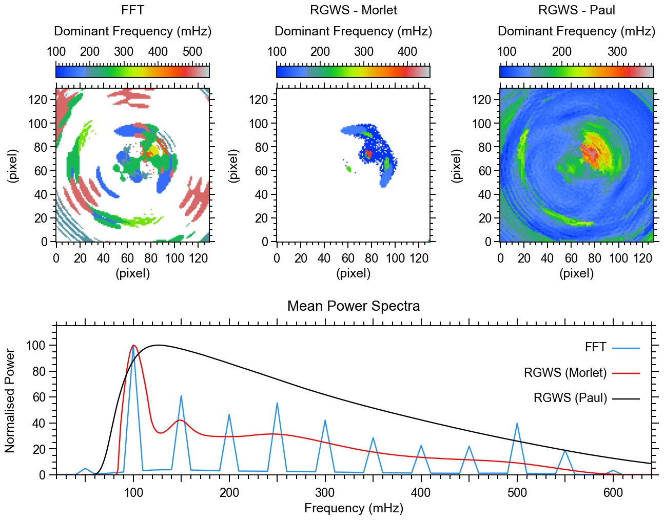
The figure below shows the dominant frequency maps calculated using different spectral analysis methods. The maps reveal the spatial distribution of the most prominent oscillation frequencies in the dataset.

Methods used:

  • Fast Fourier Transform (FFT)
  • Refined Global Wavelet Spectrum (RGWS) with Morlet wavelet
  • Refined Global Wavelet Spectrum (RGWS) with Paul wavelet

WaLSAtools version: 1.0

These particular analyses generate the figure below (Figure 4 in Nature Reviews Methods Primers; copyrighted). For a full description of the datasets and the analyses performed, see the associated article. See the source code at the bottom of this page (or here on Github) for a complete analyses and the plotting routines used to generate this figure.

jpg

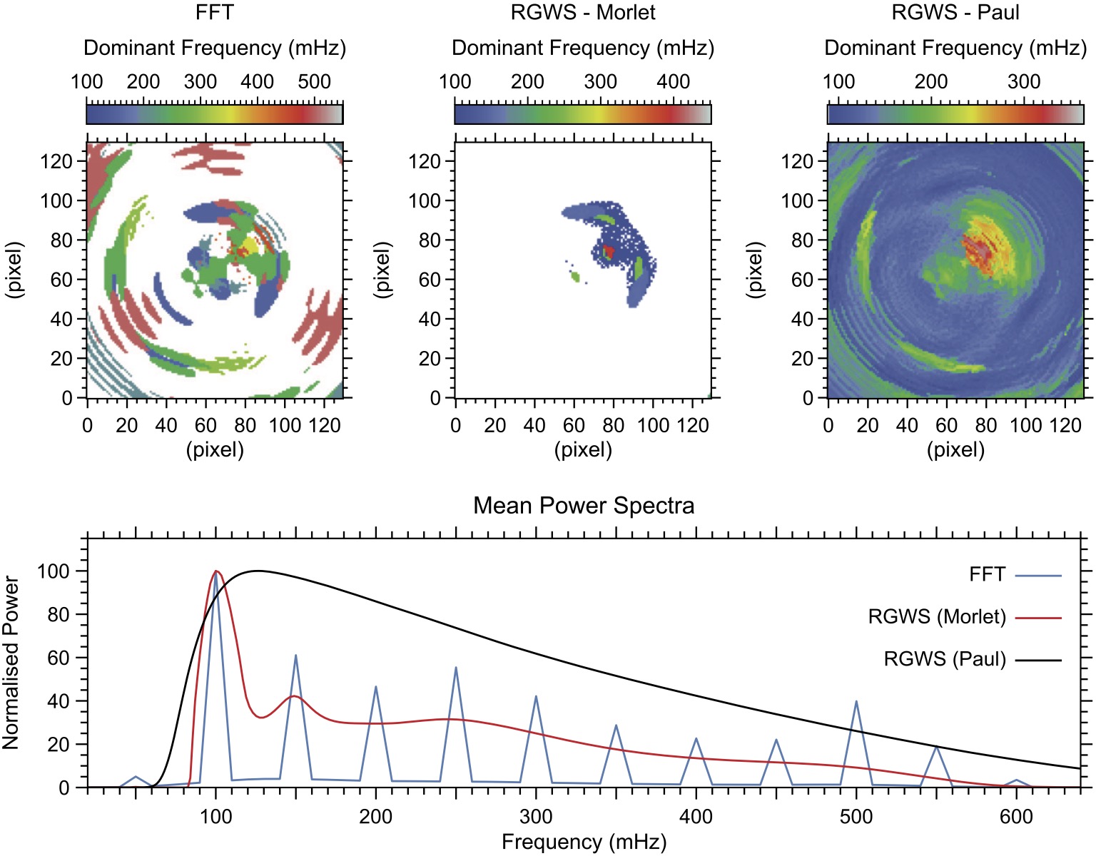
Figure Caption: Dominant frequency maps and mean power spectra. Top row: Dominant frequency maps derived using FFT (left), Morlet-based RGWS (middle), and Paul-based RGWS (right). Bottom panel: Normalized mean power spectra for FFT (blue), Morlet-based RGWS (red), and Paul-based RGWS (black).

Important Notes on Interpreting the Dominant Frequencies

The dominant frequency at each pixel corresponds to the frequency with the highest spectral power. While a linear detrending and Tukey apodization (with 0.1 tapering fraction) have been applied to reduce long-term trends and edge effects, the lowest frequency bin may still appear dominant — especially in regions without strong higher-frequency oscillations.

This is a common outcome in time series with broad, low-frequency variability, where power is not concentrated at narrow peaks, or limited by frequency resolution. However, this does not necessarily reflect meaningful or coherent low-frequency wave activity.

In the figure, white regions indicate pixels where the dominant frequency falls into the lowest frequency bin, which is explicitly mapped to white in the color table (see line 23 of the plotting routine). These are only visible in the FFT and Morlet-based RGWS maps.

The Paul-based RGWS map, on the other hand, does not show white regions. This is because, for this method, the dominant frequencies tend to fall slightly above the lowest bin (around 100-120 mHz), even though the method includes lower frequencies. This behavior reflects the fundamental differences among the analysis techniques used:

📌 FFT (Fast Fourier Transform)
◍ Provides relatively high frequency resolution at all frequencies, with fixed, global basis functions.
◍ Sensitive to any persistent oscillatory signal, but often returns low-frequency peaks if stronger high-frequency signals are absent.
◍ In the averaged power spectrum, the dominant peak lies at 100 mHz — the lowest available frequency bin.

📌 Morlet-based RGWS
◍ Uses the Morlet wavelet, which offers good frequency resolution but less precise time localization, particularly well-suited to capturing persistent oscillations with quasi-stationary frequencies.
◍ As with all RGWS methods, the frequency resolution is non-uniform, leading to narrower and more pronounced peaks at lower frequencies, and broader, smoother features at higher frequencies in the power spectrum.
◍ This causes the spectrum to mirror FFT’s tendency to favor the lowest bin as dominant when no strong high-frequency signals are present, but with less detail in the dominant frequency map, compared to FFT, due to smoothing at high frequencies.

📌 Paul-based RGWS
◍ Employs the Paul wavelet, which has excellent time localization but poorer frequency resolution, particularly at low frequencies. This causes the lowest frequency bin to appear more diffuse, with power spread across a broader range, making sharp low-frequency peaks less distinguishable.
◍ It responds strongly to short-lived or localized features in the data, but tends to underrepresent broad, slowly varying components. As a result, power in the lowest frequency bin is often weakened or distributed, making it less likely to be selected as dominant.
◍ Consequently, the mean power spectrum peaks around 120 mHz, and white regions do not appear in the dominant frequency map, since the 100 mHz bin is rarely the strongest in this method.

These differences emphasize that dominant frequency maps depend strongly on the method used, and should always be interpreted in tandem with the full power spectra (see bottom panel of Figure 4) and with awareness of each method's strengths and limitations.

Source code

© 2025 WaLSA Team - Shahin Jafarzadeh et al.

This notebook is part of the WaLSAtools package (v1.0), provided under the Apache License, Version 2.0.

You may use, modify, and distribute this notebook and its contents under the terms of the license.


Important Note on Figures: Figures generated using this notebook that are identical to or derivative of those published in:
Jafarzadeh, S., Jess, D. B., Stangalini, M. et al. 2025, Nature Reviews Methods Primers, in press,
are copyrighted by Nature Reviews Methods Primers. Any reuse of such figures requires explicit permission from the journal.

Figures that are newly created, modified, or unrelated to the published article may be used under the terms of the Apache License.


Disclaimer: This notebook and its code are provided "as is", without warranty of any kind, express or implied. Refer to the license for more details.

 1
 2
 3
 4
 5
 6
 7
 8
 9
10
11
12
13
14
15
16
17
18
19
20
21
22
23
24
25
26
27
28
29
30
31
32
33
34
35
36
37
38
39
40
41
42
43
44
45
46
47
48
49
50
51
52
53
54
55
56
57
import numpy as np
from astropy.io import fits
from WaLSAtools import WaLSAtools, WaLSA_save_pdf, WaLSA_histo_opt

#--------------------------------------------------------------------------

# Load synthetic data
data_dir = 'Synthetic_Data/'

hdul = fits.open(data_dir + 'NRMP_signal_3D.fits')
signal_3d = hdul[0].data  # 3D synthetic signal data
time = hdul[1].data  # Time array
hdul.close()

cadence = 0.5  # cadence in seconds

# FFT Analysis using WaLSAtools
FFT_dominant_frequency, FFT_averaged_power, FFT_frequencies, FFT_pm = WaLSAtools(
    signal=signal_3d,
    time=time,
    method='fft',
    format='txy',
    averagedpower=True,
    dominantfreq=True
)
# Normalize FFT averaged power to its maximum value
FFT_averaged_power_normalized = 100 * FFT_averaged_power / np.max(FFT_averaged_power)

# RGWS-Morlet Analysis using WaLSAtools
Morlet_dominant_frequency, Morlet_averaged_power, Morlet_frequencies, Morlet_pm = WaLSAtools(
    signal=signal_3d,
    time=time,
    method='wavelet',
    mother='morlet',
    RGWS=True,
    siglevel=0.95,
    format='txy',
    averagedpower=True,
    dominantfreq=True
)
# Normalize RGWS-Morlet averaged power to its maximum value
Morlet_averaged_power_normalized = 100 * Morlet_averaged_power / np.max(Morlet_averaged_power)

# RGWS-Paul Analysis using WaLSAtools
Paul_dominant_frequency, Paul_averaged_power, Paul_frequencies, Paul_pm = WaLSAtools(
    signal=signal_3d,
    time=time,
    method='wavelet',
    mother='paul',
    RGWS=True,
    siglevel=0.95,
    format='txy',
    averagedpower=True,
    dominantfreq=True
)
# Normalize RGWS-Paul averaged power to its maximum value
Paul_averaged_power_normalized = 100 * Paul_averaged_power / np.max(Paul_averaged_power)

Processing FFT for a 3D cube with format 'txy' and shape (200, 130, 130).
Calculating Dominant frequencies and/or averaged power spectrum (FFT) ....
Progress: 100.00%
Analysis completed.
Processing Wavelet for a 3D cube with format 'txy' and shape (200, 130, 130).
Calculating Dominant frequencies and/or averaged power spectrum (Wavelet) ....
Progress: 100.00%
Analysis completed.
Processing Wavelet for a 3D cube with format 'txy' and shape (200, 130, 130).
Calculating Dominant frequencies and/or averaged power spectrum (Wavelet) ....
Progress: 100.00%
Analysis completed.

  1
  2
  3
  4
  5
  6
  7
  8
  9
 10
 11
 12
 13
 14
 15
 16
 17
 18
 19
 20
 21
 22
 23
 24
 25
 26
 27
 28
 29
 30
 31
 32
 33
 34
 35
 36
 37
 38
 39
 40
 41
 42
 43
 44
 45
 46
 47
 48
 49
 50
 51
 52
 53
 54
 55
 56
 57
 58
 59
 60
 61
 62
 63
 64
 65
 66
 67
 68
 69
 70
 71
 72
 73
 74
 75
 76
 77
 78
 79
 80
 81
 82
 83
 84
 85
 86
 87
 88
 89
 90
 91
 92
 93
 94
 95
 96
 97
 98
 99
100
101
102
103
104
105
106
107
108
109
110
111
112
113
114
115
116
117
118
119
120
121
122
123
124
125
126
127
128
129
130
131
132
133
134
135
136
137
138
139
140
141
142
143
144
145
146
147
148
149
150
151
152
153
154
155
import matplotlib.pyplot as plt
import numpy as np
from matplotlib.ticker import AutoMinorLocator
from matplotlib.colors import ListedColormap
from mpl_toolkits.axes_grid1 import make_axes_locatable
from mpl_toolkits.axes_grid1.inset_locator import inset_axes

# Set up the figure layout
fig = plt.figure(figsize=(12.8, 10))

# Top row: 3 squared images
positions_top = [
    [0.079, 0.484, 0.234, 0.4],  # Left image
    [0.415, 0.484, 0.234, 0.4],  # Center image
    [0.755, 0.484, 0.234, 0.4]   # Right image
]

# Define visualization parameters
xticks_labels = ['0', ' ', '40', ' ', '80', ' ', '120']

# Load the RGB values from the IDL file and create the color map
rgb_values = np.loadtxt('Color_Tables/idl_walsa_powercolor_1.txt')
rgb_values[0,:] = [255.0,255.0,255.0]
rgb_values[255,:] = [0.,0.,0.]
rgb_values = rgb_values / 255.0 
idl_colormap = ListedColormap(rgb_values)

# Setting global parameters
plt.rcParams.update({
    'font.family': 'sans-serif',     # Use sans-serif fonts
    'font.sans-serif': 'Arial',   # Set Helvetica as the default sans-serif font
    'font.size': 19,          # Global font size
    'axes.titlesize': 20,     # Title font size
    'axes.labelsize': 18,     # Axis label font size
    'xtick.labelsize': 17,    # X-axis tick label font size
    'ytick.labelsize': 17,    # Y-axis tick label font size
    'legend.fontsize': 15,    # Legend font size
    'figure.titlesize': 19,   # Figure title font size
    'axes.grid': False,        # Turn on grid by default
    'grid.alpha': 0.5,        # Grid transparency
    'grid.linestyle': '--',   # Grid line style
    'font.weight': 'medium',      # Make all fonts bold
    'axes.titleweight': 'medium', # Make title font bold
    'axes.labelweight': 'medium' # Make axis labels bold
})

plt.rc('axes', linewidth=1.3)
plt.rc('lines', linewidth=1.7)

# Plot the three snapshots in the top row
for i in range(3):
    if i == 0:
        im = FFT_dominant_frequency*1000 # Convert to mHz
        colorbar_label = 'FFT\nDominant Frequency (mHz)'
    elif i == 1:
        im = Morlet_dominant_frequency*1000 # Convert to mHz
        colorbar_label = 'RGWS - Morlet\nDominant Frequency (mHz)'
    else:
        im = Paul_dominant_frequency*1000 # Convert to mHz
        colorbar_label = 'RGWS - Paul\nDominant Frequency (mHz)'

    ax = fig.add_axes(positions_top[i])  # Create each subplot in specified position

    DF = ax.imshow(WaLSA_histo_opt(im), cmap=idl_colormap, aspect='equal', origin='lower', vmin=im.min(), vmax=im.max())

    # Configure axis ticks and labels
    ax.tick_params(axis='both', which='both', direction='out', top=True, right=True)
    ax.set_xticks(np.arange(0, 130, 20))
    ax.set_yticks(np.arange(0, 130, 20))
    ax.tick_params(axis='both', which='major', length=8, width=1.4)  # Major ticks
    ax.tick_params(axis='x', which='major', pad=8)  # Major ticks
    ax.tick_params(axis='both', which='minor', length=4, width=1.4)  # Minor ticks
    ax.xaxis.set_minor_locator(AutoMinorLocator(4))
    ax.yaxis.set_minor_locator(AutoMinorLocator(4))
    ax.set_xlabel('(pixel)')
    ax.set_ylabel('(pixel)', labelpad=12)

    # Create an inset color bar axis above the plot
    divider = make_axes_locatable(ax)
    cax = inset_axes(ax, width="100%", height="7.5%", loc='upper center', borderpad=-2.1)
    cbar = plt.colorbar(DF, cax=cax, orientation='horizontal')
    # Move color bar label to the top of the bar
    cbar.set_label(colorbar_label, labelpad=16, linespacing=2)
    cbar.ax.tick_params(direction='out', top=True, labeltop=True, bottom=False, labelbottom=False)
    cbar.ax.xaxis.set_label_position('top')
    # Adjust tick marks for the color bar
    cbar.ax.tick_params(axis='x', which='major', length=7, width=1.2, direction='out', top=True, labeltop=True, bottom=False)
    cbar.ax.tick_params(axis='x', which='minor', length=4, width=1.2, direction='out', top=True, bottom=False)
    # Set colorbar ticks and labels
    cbar.ax.xaxis.set_major_formatter(plt.FuncFormatter(lambda x, _: f'{int(x)}'))
    # Set minor ticks
    cbar.ax.xaxis.set_minor_locator(AutoMinorLocator(10)) 
    # Define the range of the color bar and set major ticks at intervals of 100
    tick_min = np.floor(DF.get_clim()[0]) 
    tick_max = np.ceil(DF.get_clim()[1]) 
    major_ticks = np.arange(np.ceil(tick_min / 100) * 100, tick_max + 1, 100)  
    cbar.set_ticks(major_ticks)
    cbar.ax.xaxis.set_major_formatter(plt.FuncFormatter(lambda x, _: f'{int(x)}'))

# Bottom row: 1D signal plot filling the entire row
ax1d = fig.add_axes([0.08, 0.08, 0.906, 0.291])  # [left, bottom, width, height]
ax1d.plot(FFT_frequencies*1000, FFT_averaged_power_normalized, color='DodgerBlue', label='FFT')
ax1d.plot(Morlet_frequencies*1000, Morlet_averaged_power_normalized, color='Red', label='RGWS (Morlet)')
ax1d.plot(Paul_frequencies*1000, Paul_averaged_power_normalized, color='Black', label='RGWS (Paul)')
ax1d.set_title('Mean Power Spectra', pad=21)
ax1d.set_xlabel('Frequency (mHz)', labelpad=5)
ax1d.set_ylabel('Normalised Power', labelpad=12)
ax1d.set_xlim([20, 640])
ax1d.set_ylim(0, 115)
# Set tick marks outside for all four axes
ax1d.tick_params(axis='both', which='both', direction='out', top=True, right=True)
# Custom tick intervals
xtick_positions = range(50, 650, 50)  # Major tick marks every 50
xlabel_positions = range(100, 700, 100)  # Labels every 100
ax1d.set_xticks(xtick_positions)
labels = [str(pos) if pos in xlabel_positions else '' for pos in xtick_positions]
ax1d.set_xticklabels(labels)
ax1d.set_yticks(np.arange(0, 115, 20))
# Custom tick sizes and thickness
ax1d.tick_params(axis='both', which='major', length=10, width=1.4, pad=5)  # Major ticks
ax1d.tick_params(axis='x', which='major', pad=8)  # Major ticks
ax1d.tick_params(axis='both', which='minor', length=6, width=1.4)  # Minor ticks
# Set minor ticks
ax1d.xaxis.set_minor_locator(AutoMinorLocator(5))
ax1d.yaxis.set_minor_locator(AutoMinorLocator(4))
# Add custom labels manually to the plot .... to align the labels to the right
handles, labels = ax1d.get_legend_handles_labels()
# Define the vertical offset for each legend item
offset = 0.17
for i, (handle, label) in enumerate(zip(handles, labels)):
    # Add the colored line
    ax1d.plot(
        [0.935, 0.98],  # x coordinates (start and end of the line)
        [0.85 - offset * i, 0.85 - offset * i],  # y coordinates (constant to make it horizontal)
        transform=ax1d.transAxes,
        color=handle.get_color(),  # Use the color from the original handle
        linestyle=handle.get_linestyle(),  # Use the linestyle from the original handle
        linewidth=handle.get_linewidth(),  # Use the linewidth from the original handle
    )

    # Add the label text
    ax1d.text(
        0.925, 0.85 - offset * i, 
        label,
        transform=ax1d.transAxes,
        ha='right', va='center', fontsize=17, 
    )

#--------------------------------------------------------------------------

# Save the figure as a single PDF
pdf_path = 'Figures/Fig4_dominant_frequency_mean_power_spectra.pdf'
WaLSA_save_pdf(fig, pdf_path, color_mode='CMYK')

plt.show()

GPL Ghostscript 10.04.0 (2024-09-18)
Copyright (C) 2024 Artifex Software, Inc. All rights reserved.
This software is supplied under the GNU AGPLv3 and comes with NO WARRANTY:
see the file COPYING for details.
Processing pages 1 through 1.
Page 1
PDF saved in CMYK format as 'Figures/Fig4_dominant_frequency_mean_power_spectra.pdf'

png